CSS Interview Questions & Answers
Ans: CSS stands for Cascading Style Sheet. It is a popular styling language which is used with HTML to design websites. CSS is used to develop a consistent look and feel for all the pages.
2) What is the origin of CSS?
Ans: SGML (Standard Generalized Markup Language) is the origin of CSS. It is a language that defines markup languages.
3) What are the different variations of CSS?
Ans: Following are the different variations of CSS:
- CSS1
- CSS2
- CSS2.1
- CSS3
- CSS4
4) What is the difference between CSS2 and CSS3?
Ans: The main difference between CSS2 and CSS3 is that CSS3 is divided into different sections which are also known as modules. Unlike CSS2, CSS3 modules are supported by many browsers.
Apart from that, CSS3 contains new General Sibling Combinators which is responsible for matching the sibling elements with the given elements.
5) How can you integrate CSS on a web page?
Ans: There are three methods to integrate CSS on web pages.
Inline method : It is used to insert style sheets in HTML document.
Embedded/Internal method : It is used to add a unique style to a single document.
Linked/Imported/External method : It is used when you want to make changes on multiple pages.
6) What are the advantages of CSS?
Ans: The advantages of CSS are:
- Bandwidth
- Site-wide consistency
- Page reformatting
- Accessibility
- Content separated from presentation
7) What are the limitations of CSS?
Ans: The limitations of CSS are
- Ascending by selectors is not possible
- Limitations of vertical control
- No expressions
- No column declaration
- Pseudo-class not controlled by dynamic behavior
- Rules, styles, targeting specific text not possible
8) What are the CSS frameworks?
Ans: CSS frameworks are the preplanned libraries which make easy and more standard compliant web page styling. The frequently used CSS frameworks are:
- Bootstrap
- Foundation
- Semantic UI
- Gumby
- Ulkit
9) Why background and color are the separate properties if they should always be set together?
Ans: There are two reasons behind this:
- It enhances the legibility of style sheets. The background property is a complex property in CSS, and if it is combined with color, the complexity will further increase.
- Color is an inherited property while the background is not. So this can make confusion further.
10) What is Embedded Style Sheet?
Ans: An Embedded style sheet is a CSS style specification method used with HTML. You can embed the entire stylesheet in an HTML document by using the STYLE element.
11) What are the advantages of Embedded Style Sheets?
Ans: The main advantages of Embedded style sheets are:
- You can create classes for use on multiple tag types in the document.
- You can use selector and grouping methods to apply styles in complex situations.
- No extra download is required to import the information.
12) What is a CSS selector?
Ans: It is a string that identifies the elements to which a particular declaration apply. It is also referred as a link between the HTML document and the style sheet. It is equivalent of HTML elements. There are several different types of selectors in CSS:
- CSS Element Selector
- CSS Id Selector
- CSS Class Selector
- CSS Universal Selector
- CSS Group Selector
13) What is the difference between a class and an ID?
Ans. Class is a way of using HTML elements for styling. They are not unique and have multiple elements. Whereas ID is unique and it can be assigned to a single element.
14) What is the use of CSS Opacity?
Ans: The CSS opacity property is used to specify the transparency of an element or to make the background of an element more transparent (or less). In simple word, you can say that it specifies the clarity of the image. In technical terms, Opacity is defined as the degree to which light is allowed to travel through an object.
15) Explain universal selector?
Ans: The universal selector matches the name of any of the element type instead of selecting elements of a specific type.
16) What is the use of % unit?
Ans: It is used for defining percentage values.
17) What is the CSS Box model and what are its elements?
Ans: The CSS box model is used to define the design and layout of elements of CSS.
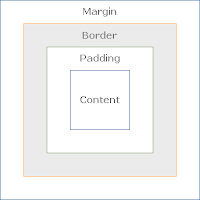 The elements are:
- Margin - It removes the area around the border. It is transparent.
- Border - It represents the area around the padding
- Padding - It removes the area around the content. It is transparent.
- Content - It represents the content like text, images, etc.
18) Explain the difference between visibility: hidden and display: none?
Ans: visibility: hidden hides the element, but it occupies space and affects the layout of the document.
display: none also hides the element but not occupy space. It will not affect the layout of the document.
19) Name the property used to specify the background color of an element?
Ans: The background-color property is used to specify the background color of the element.
20) Name the property for controlling the image repetition of the background?
Ans: The background-repeat property repeats the background image horizontally and vertically. Some images are repeated only horizontally or vertically.
21) Name the property for controlling the image position in the background?
Ans: The background-position property is used to define the initial position of the background image. By default, the background image is placed on the top-left of the webpage.
You can set the following positions:
- center
- top
- bottom
- left
- right
22) Name the property for controlling the image scroll in the background?
Ans: The background-attachment property is used to specify if the background image is fixed or scroll with the rest of the page in the browser window. If you set fixed the background image, then the image not move during scrolling in the browser. Let's take an example with the fixed background image.
23) What is the use of ruleset?
Ans: The ruleset is used to identify that selectors can be attached with other selectors. It has two parts:
- Selector : Selector indicates the HTML element you want to style.
- Declaration Block : The declaration block can contain one or more declarations separated by a semicolon.
24) What are the advantages of External Style Sheets?
Ans: The advantages of external style sheets are:
- You can create classes for reusing it in many documents.
- By using it, you can control the styles of multiple documents from one file.
- In complex situations, you can use selectors and grouping methods to apply styles.
25) What is the difference between inline, embedded and external style sheets?
Ans: Inline: Inline Style Sheet is used to style only a small piece of code.
For Example:
<htmltag style="cssproperty1:value; cssproperty2:value;"> </htmltag>
Embedded: Embedded style sheets are put between the <head>...</head> tags.
For Example:
<style>
body {
background-color: linen;
}
h1 {
color: red;
margin-left: 80px;
}
</style>
<head>
<link rel="stylesheet" type="text/css" href="mystyle.css">
</head>
26) What do you understand by W3C?
Ans: W3C stands for World Wide Web Consortium. Its purpose is to deliver the information of the World Wide Web. It also develops rules and guidelines for the Web.
27) What is RWD?
Ans: RWD stands for Responsive Web Design. This technique is used to display the designed page perfectly on every screen size and device, for example, mobile, tablet, desktop and laptop. You don't need to create a different page for each device.
28) What is tweening?
Ans: It is the process of generating intermediate frames between two images.It gives the impression that the first image has smoothly evolved into the second one.It is an important method used in all types of animations.
In CSS3, Transforms (matrix, translate, rotate, scale) module can be used to achieve tweening.
29) What are the benefits of CSS sprites?
Ans: If a web page has a large number of images that take a longer time to load because each image separately sends out an HTTP request. The concept of CSS sprites is used to reduce the loading time for a web page because it combines the various small images into one image. It reduces the number of HTTP requests and hence the loading time.
30) What is the difference between logical tags and physical tags?
Ans: Physical tags are referred to as presentational markup while logical tags are useless for appearances.
Physical tags are newer versions, on the other hand, logical tags are old and concentrate on content.
31) What is the float property of CSS?
Ans: The CSS float property is used to move the image to the right or left along with the texts to be wrapped around it. It doesn't change the property of the elements used before it.
To understand its purpose and origin, let's take a look at its print display. In the print display, an image is set into the page such that text wraps around it as needed.
32) How to restore the default property value using CSS?
Ans: In short, there is no easy way to restore to default values to whatever a browser uses.
The closest option is to use the 'initial' property value, which restores the default CSS values, rather than the browser's default styles.
33) What property is used for changing the font face?
Ans: We can use the font-family property for achieving this. The font-family property is used for specifying what font needs to be applied on the targeted DOM element.
34) What is VH/VW (viewport height/ viewport width) in CSS?
Ans: It’s a CSS unit used to measure the height and width in percentage with respect to the viewport. It is used mainly in responsive design techniques. The measure VH is equal to 1/100 of the height of the viewport. If the height of the browser is 1000px, 1vh is equal to 10px. Similarly, if the width is 1000px, then 1 vw is equal to 10px.
35) Difference between reset vs normalize CSS?. How do they differ?
Ans: Reset CSS: CSS resets aim to remove all built-in browser styling. For example margins, paddings, font-sizes of all elements are reset to be the same.
Normalize CSS: Normalize CSS aims to make built-in browser styling consistent across browsers. It also corrects bugs for common browser dependencies.
36) Does margin-top or margin-bottom have an effect on inline elements?
Ans: No, Margin-top or margin-bottom does not have an effect on the inline elements.
37) Is it important to test the webpage in different browsers?
Ans: Yes, it is the most crucial thing or the most important trial to do when you design a webpage for the first time and make changes to it. Testing your website periodically in different browsers will help you make every webpage compatible with it as browsers have been going through many updates.
38) What are Pseudo elements and Pseudo classes?
Ans: Pseudo-elements allows us to create items that do not normally exist in the document tree, for example ::after.
- ::before
- ::after
- ::first-letter
- ::first-line
- ::selection
- :link
- :visited
- :hover
- :active
- :focus
39) What do the following CSS selectors mean?
Ans:
- div, p : This selector implies selecting all div elements and all p elements.
- div p : This selector tells to select all p elements that are inside div elements.
- div ~ p : This selector tells to select all p elements that have div elements preceeded anywhere.
- div + p : This selector says to select all p elements placed immediately after the div element.
- div > p : This selector says to select all p elements which has div as an immediate parent.
40) Difference between CSS grid vs flexbox?
Ans: CSS Grid Layout is a two-dimensional system, meaning it can handle both columns and rows. Grid layout is intended for larger-scale layouts which aren’t linear in design.
Flexbox is largely a one-dimensional system (either in a column or a row). Flexbox layout is most appropriate to the components of an application.
41) Explain CSS position property?
Ans: The CSS position properties are:
- Absolute: To place an element exactly where you want to place it. absolute position is actually set relative to the element's parent. if no parent is available then the relative place to the page itself (it will default all the way back up to the element).
- Relative: "Relative to itself". Setting position: relative; on an element and no other positioning attributes, it will no effect on its positioning. It allows the use of z-index on the element and it limits the scope of absolutely positioned child elements. Any child element will be absolutely positioned within that block.
- Fixed: The element is positioned relative to the viewport or the browser window itself. viewport doesn't change if you scroll and hence the fixed element will stay right in the same position.
- Static: Static default for every single page element. The only reason you would ever set an element to position: static is to forcefully remove some positioning that got applied to an element outside of your control.
- Sticky: Sticky positioning is a hybrid of relative and fixed positioning. The element is treated as relative positioned until it crosses a specified threshold, at which point it is treated as fixed positioned.
42) Different Box Sizing Property?
Ans: The box-sizing CSS property sets how the total width and height of an element are calculated.
- Content-box: The default width and height values apply to the element's content only. The padding and border are added to the outside of the box.
- Padding-box: Width and height values apply to the element's content and its padding. The border is added to the outside of the box. Currently, only Firefox supports the padding-box value.
- Border-box: Width and height values apply to the content, padding, and border.
43) What is the purpose of the z-index and how is it used?
Ans: The z-index helps to specify the stack order of positioned elements that may overlap one another. The z-index default value is zero and can take on either a positive or negative number.
An element with a higher z-index is always stacked above than a lower index.
Z-Index can take the following values:
- Auto: Sets the stack order equal to its parents.
- Number: Orders the stack order.
- Initial: Sets this property to its default value (0).
- Inherit: Inherits this property from its parent element.
44) What is media query and why it is used?
Ans: Media queries are a key part of responsive web design, CSS media queries are a feature in CSS that allows you to apply styles to an element based on the characteristics of the device or screen displaying the content. This includes factors like screen width, height, resolution, orientation, and more.
For Example :
@media screen and (min-width: 480px) {
body {
background-color: lightgreen;
}
}
45) Can you name the four types of @media properties?
Ans: The four types of @media properties are:
- All → It’s the default property. Used for all media-type devices.
- Screen → Used for computer screen, mobile screen.
- Print → Used for printers.
- Speech → Used for screen readers.
46) Explain responsive web design?
Ans: Responsive Design is a web page creation approach that uses flexible images, flexible layouts, and CSS media queries. This design approach aims to build web pages that detect the orientation and screen size of the visitors so that the layout can be changed accordingly.
47) What are the differences between adaptive design and responsive design?
Ans: The main differences between adaptive design and responsive design are:
Adaptive Design:
- Main focus is to develop a website in multiple fixed layout sizes.
- Offers good control over the design to develop variation in screens.
- It is very time-consuming and takes a lot of effort to build the best possible adaptive design as examining it will need to go for many options with respect to the realities of the end user.
- There are six standard screen sizes for the appropriate layouts; they are 320px, 480px, 760px, 960px, 1200px, 1600px to design.
Responsive Design
- Main focus is to show content with respect to browser space.
- Offers less control over the design.
- It takes less time to build the design and there is no screen size issue irrespective of content.
- It uses CSS media queries to design the screen layouts with respect to specific devices and property changes in the screen.
48) What is a CSS Preprocessor? What are Sass, Less, and Stylus? Why do people use them?
Ans: CSS preprocessor is a tool used to enhance the basic functionality and let us use the complex logical syntax such as variables, functions, mixins, and code nesting within vanilla CSS scripts themselves.
- Sass (Syntactically Awesome Style Sheets) uses .sass extension. It is used for indentation; it doesn’t use semicolons or curly brackets.
- Less (Leener Stylesheets) uses .less extension. It is easy to add to any JavaScript Project by using NPM or less.js file. Here, @ is used to define the variables.
- Stylus provides great flexibility in writing syntax. It is able to use native CSS as well as the exclusion of brackets, colons, and semicolons. There is no need to use @ or $ to define the variables.
No comments:
Post a Comment